Role:
- Research
- UX Design
- UI Design
- User Testing
- Prototyping
Tools:
- Adobe XD
- Adobe Illustrator
- Adobe InDesign
- Mural
- XMind
Duration:
- 8 months
September - April 2021
Background
Many people struggle with sleep, whether it's because of a chronic condition like insomnia, a poor environment or poor habits most people, especially students and young adults struggle to get good nights sleep consistently night in, night out.
Having struggles with this myself I wanted to try and design a product whether it be physical or digital to help facilitate better sleep through building healthy habits and sticking to a pre planned schedule. Poor sleep has a massive impact on peoples health and their daily life, making it easier to build habits and make the right decision in regards to your sleep can improve many peoples quality of life and extend it as well.
Problem
It is widely known that many people have issues with sleep, with todays busier than ever individuals, it is hard to form the right habits around sleep and be able to consistently get a high quality and quantity of sleep. Lack of sleep has many adverse effects and can effect a persons daily life quite negatively.
Challenge
How might we allow users to create habits through an effective routine that facilitates better more consistent sleep behaviour.

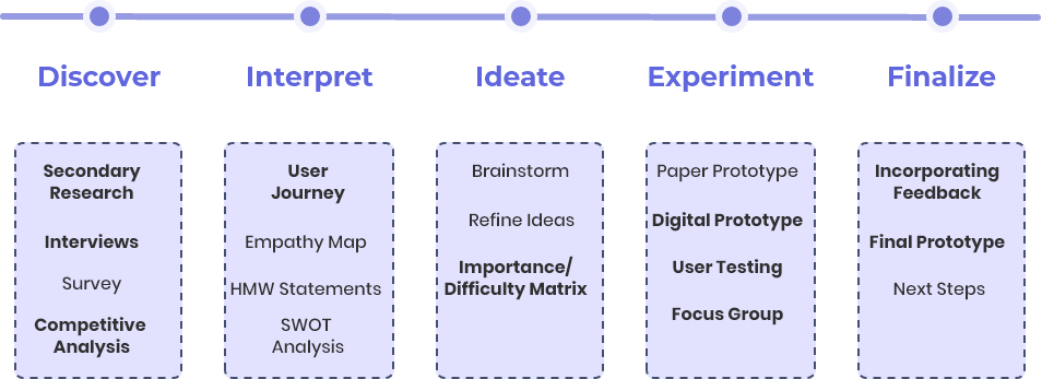
Discover | learning new things
The first step to this part of the project was gaining a deeper knowledge about sleep, what negatives effects can lack of sleep have?
What are the main hurdles people struggle with that prevent good sleep?
The biggest hurdles are a lack of constancy when it comes to a set bed time, a later bedtime reduces a persons
REM sleep which is very important for letting the body recover.
A lack of routine or doing negative activities
(coffee, alcohol, etc.) before bed can also effect your quality of sleep. Finally looking at screens right before
bed can delay the release of certain brain chemicals that facilitate the different stages of sleep, so staring at
your phone in bed is a no go.
The human element
The next step was to do some primary user research and get a sense of what people struggle with on a daily basis and try to figure out what causes their interrupted sleep schedules? What are their routines like and are they effective?

6 User Interviews
1 Expert Interview
- "Regardless of age, regular schedules and bedtime rituals help us get the sleep we need and give us the ability
to function at peak levels"
- "Repeated use of bright screens in the evening over five nights can delay the body clock by 1.5 hours"

Focus Group
- "I have the energy to do the things I wanted to do if a get a good nights sleep"
- Participants use music or audio to help them get to sleep.
- Sleep tracking apps aren't helpful.

User Survey
- 35% of responses stated that they did not have a sleep routine in place.
- When asked why they incorporated relaxing activities into their routine, most stated that it helps calm them down and takes their mind off of stressful events of the day.
Competative Analysis
Wanting to see how already existing products tackle this market, what types of features do they include and what are some pros and cons of these products.
Apple Sleep

This was a good thing to look into, some of the reviews online stated that although the native Apple sleep app was a good start, there are better third party apps out there, these third party apps can be used as inspiration and a way to gain more insight into the market for these types of sleep aid apps.
Some of the third party apps mentioned include:
Sleep++, AutoSleep, NapBot and Pillow.
The wind down feature is also interesting, as it integrates music apps, podcast apps and note apps into the sleep app to give the user a more complete and personalized experience.
Interpret | getting a clearer picture
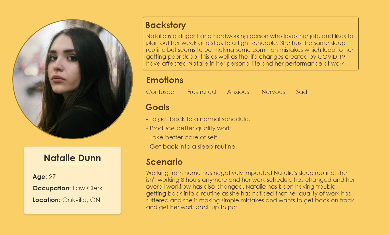
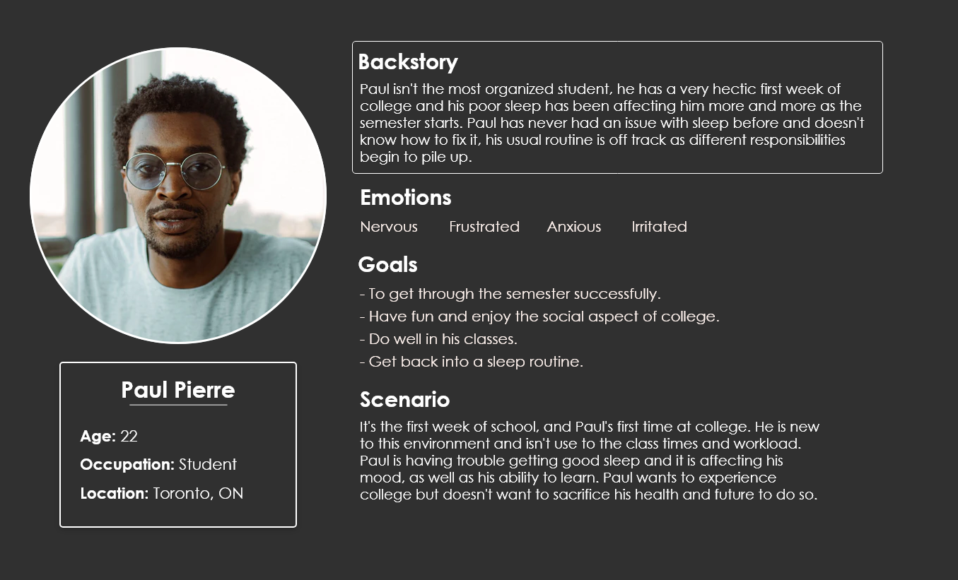
Personas

User Journey

Ideate | narrowing it down
Importance/ Difficult Matrix
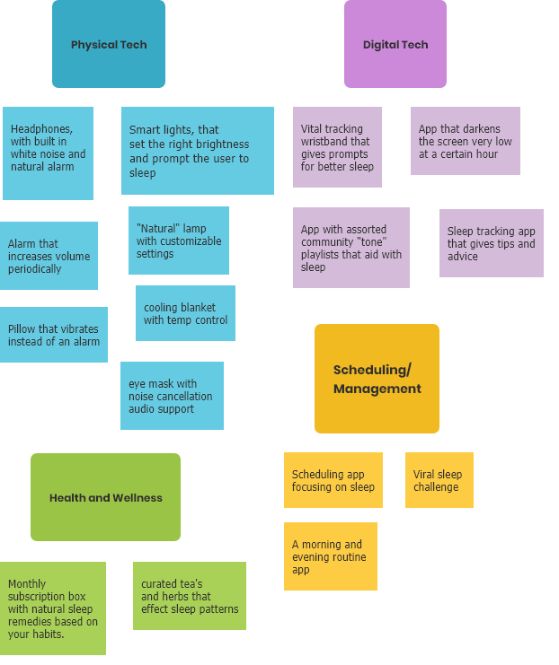
After completing brainstorming & refining ideas I decided to use the Importance/ Difficulty matrix to narrow ideas down even further.
Using this method it was quite easy to separate the realistic and achievable ideas and helped define the scope for the project, making this decision here based on the research was very vital as it allowed more time for prototyping, user testing and refining the final prototype with the user feedback.
Experiment | initial prototype
After establishing a direction to take the prototype the next step was to solidify the core design principals of the app.

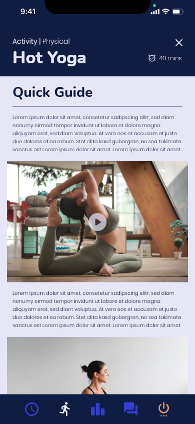
 Activity Guide
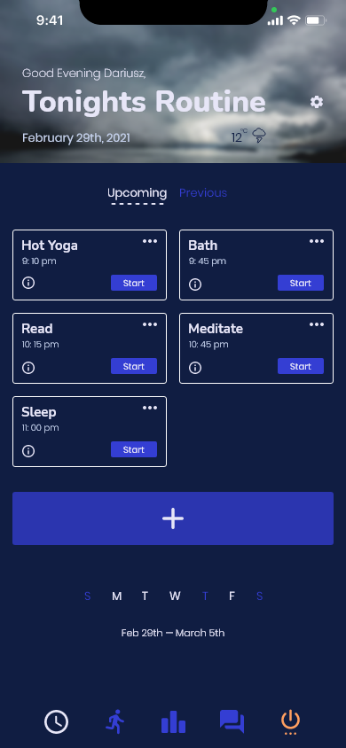
 Home page
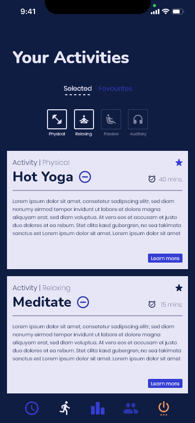
 Your Activities page
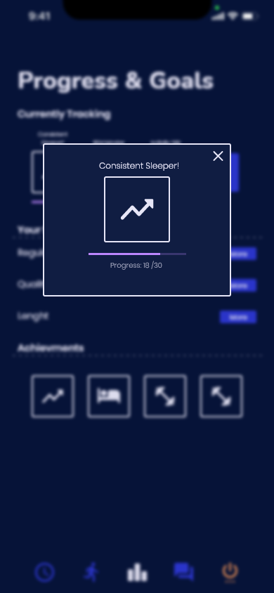
 Rewards
 Rewards Popup
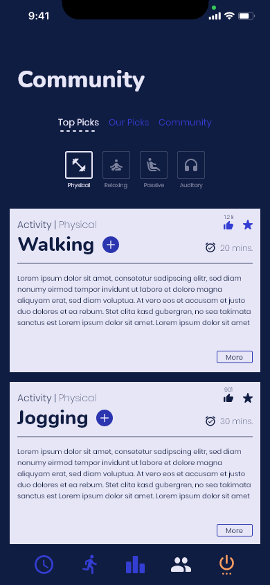
 Community page
User Testing
User testing was very vital to the refinement and completion of the final prototype for this project,
having set a number of learning goals and setting out a task list for users to complete the user testing sessions were very influential and provided different perspectives to learn from.
- Opinion on the UI and how it looks to the user in a evening/ night context.
- The structure of the app and the overall user experience.
- The effectiveness of the routine and activity pages.
- Would the rewards actually be rewarding?
- Add and activity to your nightly routine.
- Select the 'Hot Yoga' activity and scroll through the card.
- Go to the 'Progress' tab and view an achievement.
- Navigate to the settings menu and change the 'sleep
tracking' setting.
Feedback and Adjustments
- Use less information in the preview cards for the activities.
- The rewards are an effective way to encourage the user.
- Status icon in the navigation bar is confusing.
- Users might not always stick to the routine, how to make the more accountable.
- Use less information in the preview cards for the activities.
- Colour code activities with flags or icons. (reduce the amount of writing in the activity cards).
- Graphs showing the users sleep stats.
- Filter activities depending on the type of guide (photo, video or written).
Visual Testing | improving the interface
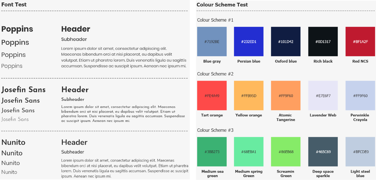
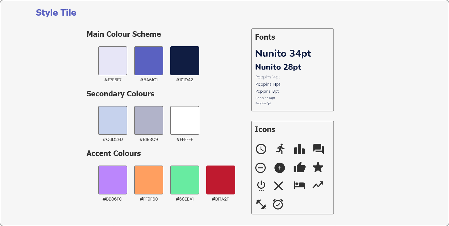
I used a focus group and A&B testing to try out some various font, colour and icon options.
This is the final choice and what I ended up using going forward.


Finalize | putting it all together
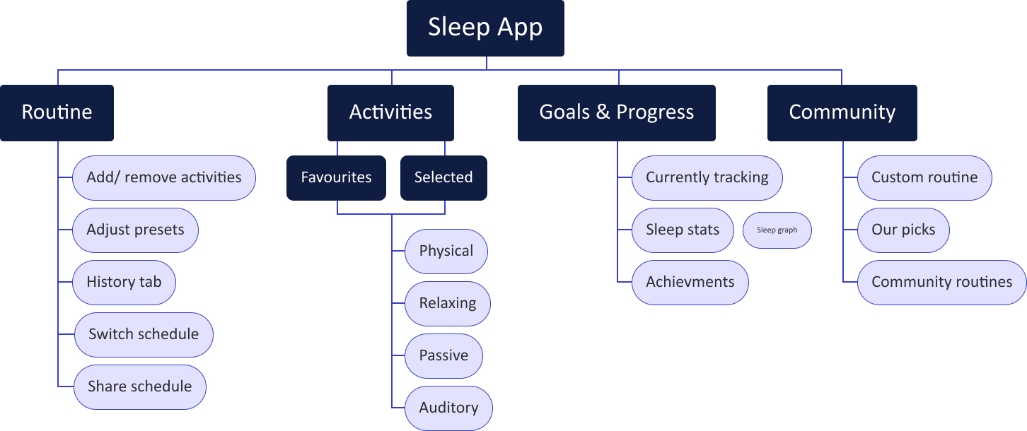
Site Map
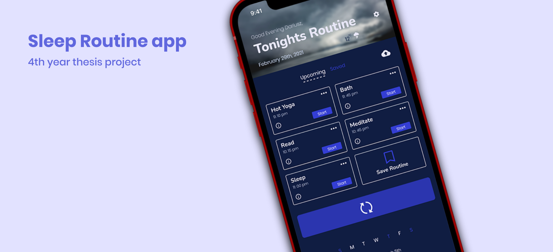
Easy Scheduling and routine management.

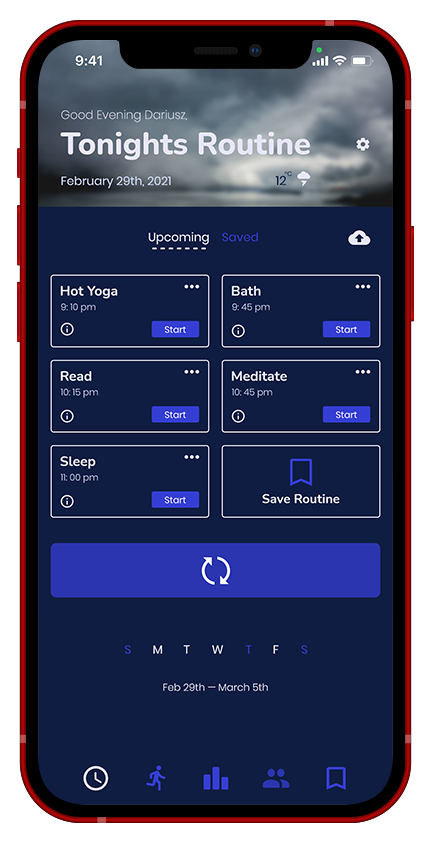
Home page
- User can quickly comprehend their routine and make adjustments on the fly
- User can set specific days of the week, and switch out the whole routine with either a user created or community routines.

Routine page
- View custom routines, staff picks and community created routines.
- Quick summary of the routine, can be edited or quickly switched out, making it easy to select a routine that works for you, even if that changes suddenly.

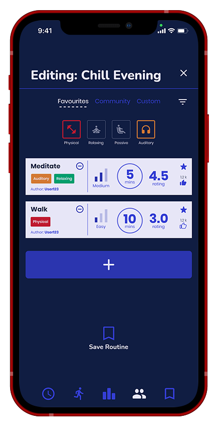
Edit Routine page
- Add more activities to a routine, and quickly save the routine.
- Changed the navigation bar, and added a bookmark icon for saved routines.
- Changed the custom routine page to be more clear and simple, making a decision is easier and less frustrating.
- Dedicated page for editing and customising a routine.
Custom activities and community suggestions.

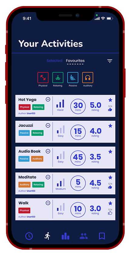
Activities page
- Categories for various activities sorted into different experiences.
- Simple and easy to understand activity cards, with a difficulty, time and user rating.

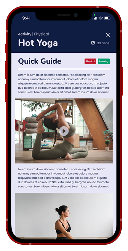
Activity instruction card
- Activity instruction card, doesn't apply to all activities, only more difficult or complicated activities.
- Also allows users to discover new activities and hobbies all in the same place.
- Created more concise and easier to understand activity cards, with tags and basic information displayed
- Dedicated page for editing and customising a routine.
Rewards and useful sleep stats

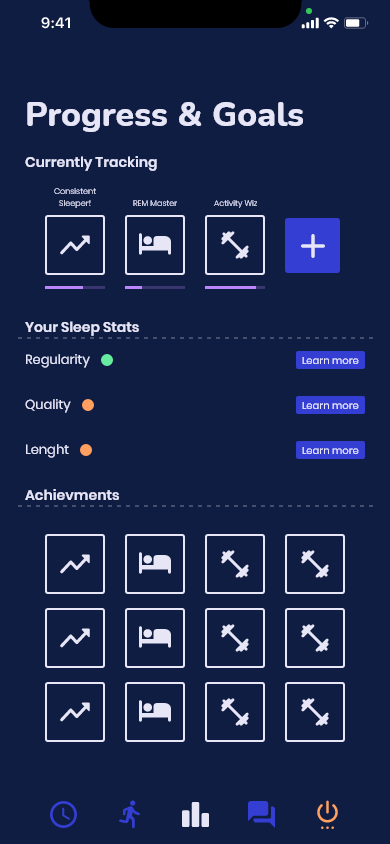
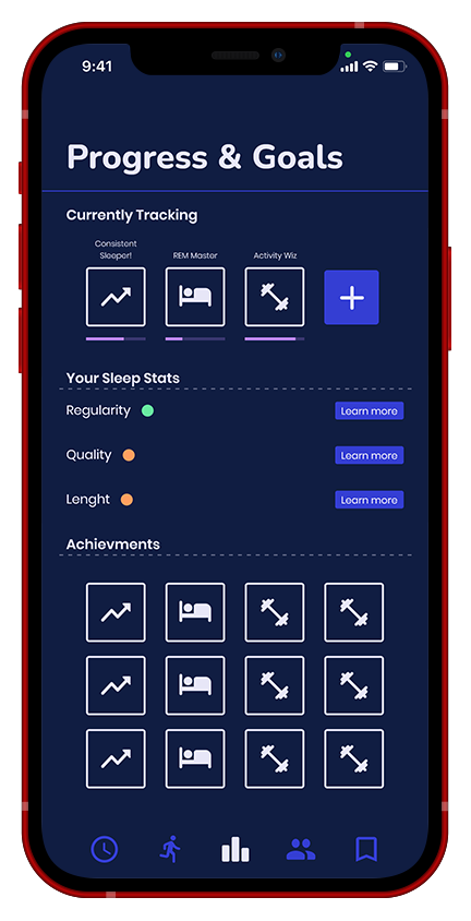
Progress and Goals page
- Can track custom achievements, and get a quick glance at the progress towards them. Helps visualise progress and give extrinsic motivation.
- Sleep stats, quick visual summary of users sleep success.

Advanced stats popup
- Advanced sleep stats, giving the user a better understanding of where they can improve.
- Rewards are easier to understand and track.
- More in depth sleep stats, but also easy to understand.
UX Outline
Psychology
User Motivation:
The users motivation would be to achieve better more consistent sleep, that would hopefully be the initial motivation to get the user to download the app and begin to use it, when people want to get in shape or form a certain habit or just improve themselves in general they will usually look towards apps because its simple and doesn't require any commitment, this app will help users get better sleep over time and begin to form a healthier more consistent lifestyle.
Habits:
The main habit that I want to form is regularity of sleep, meaning that the user gets to bed on time and wakes up on time everyday, this will show results within a few weeks and habits are usually formed after about 2 weeks (this is obviously based on the specific user). Another habit would be discipline, the discipline to complete activities and avoid phone use before bed, both of these are also important and can really impact the quality and quantity of sleep.
Rewards:
The user will be rewarded with achievements that they would gain through completing activities, getting to bed on time and generally sticking to their selected routines, the user would be held accountable but also rewarded for their success with an intrinsic reward.
Usability
User Input:
Created a very streamlined and simple experience with my application, I knew that a schedule/ calendar system would have to be implemented in the app and wanted to come up with a less tedious way of filling up a schedule, most scheduling requires the user the fill out the details, I wanted to avoid that by having each activity already include a set amount of time it would take, this cuts down on the amount of interaction and 'clicks' needed to apply changes to the routine. Making this easier and more efficient would help users discover new activities to try and if they needed a last minute change they could apply it with a few taps.
Clarity:
I wanted to make the interface and the interactions within the app as simple as possible, limiting the number of 'clicks' or 'taps' and trying to make each interaction more efficient. I believe the app us quite clear on what it's intentions are, through user testing all of my participants said that the core features of the app were clear and they really didn't need any explaining to understand what the use and intentions are of each feature/ interaction.
Information:
I limited the amount of screens needed to convey information, tying to keep it as simple as possible for the user to jump right into to their routine using quick guides and knowing how much time this activity would take.
Design
Overall look:
The consensus amongst the participants in the user testing phase was that they really like the colours, buttons and overall simplicity of the interface. Two of the participants also noted how well the buttons were placed and how easy it was to find everything right off the bat.
Readability:
There was some critique about the readability of certain pages, mostly the achievements and settings pages, but overall the main features seemed to be easy to understand and readable according to the users.
Icons:
All of the participants enjoyed the icons within the app, they felt that they communicated things well, although there were some issues with the community page and its icon in the nav bar, as well as the coloured icon on the right of the nav bar, users didn't really understand either of those icons so those two have to be changed in future iterations.
Reflection
Setting yourself up for success through proper project management and following the design process has a great impact on the final result.
Research can be frustrating, but once you have a breakthrough and begin to see a path forward all of that frustration is worth it, it gives you more confidence in your work and belief in the process.
Thanks for reading! 📖
